Temporary Tattoo Collection Donates 50% to Animal Rescue!
Posted on

Posted on
Posted on
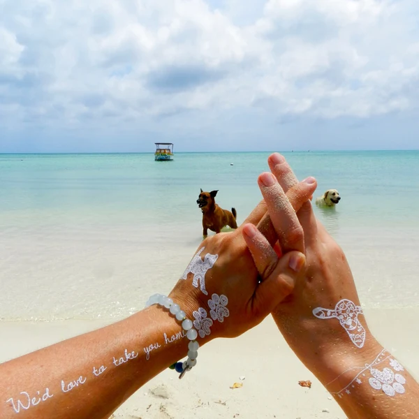
Combining lettering with a graphic mark creates a temporary tattoo arrangement that feels personal without becoming visually crowded. Script brings mood and rhythm, while a symbol adds an immediate image that can reinforce, contrast with or quietly expand the meaning of the words.
This pairing suits many occasions in Australia, from a summer music festival in Sydney to a long weekend by the coast. Temporary designs also make it easy to test a placement before committing to permanent ink, or to change your look around work, travel and social plans.
The strongest combinations usually share a detail: a similar line weight, a repeated curve or a limited colour palette. Browse the Pure Tatts collection for hand-drawn black, white and matte designs that can be styled as individual pieces or arranged into a considered set.
Think of the finished arrangement as a small composition rather than two unrelated stickers. The script may carry the emotional message, while the symbol acts as punctuation, framing device or visual shorthand. A little planning helps both elements look intentional on the skin.
Begin by choosing the feeling you want the pair to express. A fine cursive word can work beautifully with a delicate star, crescent, flower or abstract line. Bold lettering may need a stronger companion, such as a geometric shape, flame, eye or angular emblem. The goal is harmony, not an exact match.
Look for repeated qualities in the designs. Rounded script pairs naturally with circular symbols, while narrow lettering can sit beside elongated leaves, arrows or architectural forms. If both tattoos have detailed hand-drawn marks, leave enough skin between them so their fine lines remain distinct.
Meaning matters as well. A short word such as “breathe” could sit near a cloud or wave, while an initial might be balanced with a birth flower or constellation. The symbol does not need to illustrate the script literally; a subtle association often gives the combination greater personality.
A simple rule is to let one tattoo lead and the other support it. Place the larger script on the forearm, collarbone or rib area, then use a smaller symbol nearby. Alternatively, make the symbol the focal point and position a short word underneath or beside it like a caption.
Spacing controls the overall mood. Close placement creates a compact emblem, while a wider gap gives the designs a light, editorial feel. On a wrist or ankle, keep the arrangement short and directional. On the shoulder, upper arm or thigh, you can create a more open layout with a curved line of movement.
Consider how the body changes shape as it moves. Script often looks attractive along the collarbone, forearm or side of the hand, while symbols can anchor the upper edge of the arrangement. Try paper cut-outs first, moving them around in front of a mirror before applying anything.
A script tattoo can carry a name, date, phrase or single word, but shorter text is usually easier to read at temporary-tattoo scale. Choose lettering with clear spacing between characters, especially if the design will sit on a small area such as a finger, wrist or behind the ear.
Symbols offer a chance to add a second layer of meaning. A compass can suggest direction, a sun can represent energy, and a botanical motif can soften a strong phrase. Abstract symbols work well when you want the look to feel stylish without making the message too obvious.
Artist-led collections are useful when you want designs that already share a visual point of view. The story behind artist collaborations can help you identify matching line work, proportions and themes rather than mixing pieces at random.
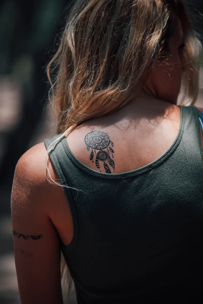
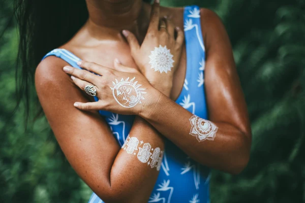
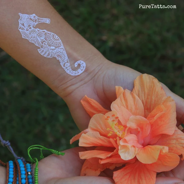
Black script is usually the easiest starting point because it provides sharp definition. A white symbol beside it can create a quiet contrast, especially on warm, sun-kissed skin or in photographs with strong natural light. White designs may appear more understated, so choose a symbol with a clear silhouette.
You can reverse the balance by using white lettering with a matte black emblem. This works particularly well for a minimal, modern arrangement. Keep the shapes uncomplicated if both designs are small; too much detail can disappear as the tattoo wears and the edges soften.
Colour is not required to make a pairing dynamic. Contrast can come from finish, density and negative space. A solid black geometric mark beside airy script produces a different effect from two fine-line designs, even when both use the same monochrome palette.
Australia’s climate affects both styling and wear. In Brisbane or Darwin, heat and humidity can make skin feel damp, while a Melbourne summer can shift from mild to intensely sunny within hours. Apply temporary tattoos to clean, dry skin and avoid placing them where sunscreen, body oil or heavy moisturiser will immediately cover the design.
Beach trips, swimming, gym sessions and outdoor festivals can shorten the life of a temporary tattoo. Areas that rub against swimmers, watchbands, socks or tight clothing may fade sooner. For a day at Bondi, a music event in Perth or a footy match in Adelaide, place the design where it will be visible without constant friction.
Everyday expectations vary too. A visible wrist tattoo may suit a weekend but need covering at work, during hospitality shifts or in settings with conservative dress requirements. Temporary ink gives you flexibility around school events, interviews and formal occasions, though workplace policies can still apply to visible body art.
Australian consumer law requires businesses to provide products that are safe, accurately described and fit for their stated purpose. Decorative temporary tattoos are generally treated differently from products making therapeutic claims, so follow the supplier’s application instructions and check the ingredient and care information before use.
Clean the skin with mild soap and water, then dry it thoroughly. Avoid freshly shaved, irritated or sunburnt areas. Press the design firmly with a damp cloth for the recommended time, and allow it to set before pulling on clothing or applying skincare nearby.
When mixing script and symbols, photograph the arrangement in daylight before it begins to fade. This helps you see whether the words remain readable and whether the visual weight feels balanced. If you want reliable guidance for regular use, review the brand’s everyday wear guidance before planning a longer event or holiday.
Removal is usually straightforward with an oil-based cleanser or rubbing alcohol, followed by gentle washing and moisturiser. Do not scrub aggressively, particularly after a day in the sun. If redness, itching or discomfort develops, remove the tattoo and stop using it; people with sensitive skin may prefer a small patch test first.
A well-matched script and symbol combination should feel easy to wear, easy to explain and easy to change. Explore monochrome lettering, geometric accents and artist-created motifs, then choose a pairing that suits your placement, schedule and personal style. Sign up for new-release and seasonal updates from Pure Tatts to find fresh designs for your next arrangement.
Posted on
Posted on
Posted on

Posted on

Posted on

Posted on
Posted on