Temporary Tattoo Collection Donates 50% to Animal Rescue!
Posted on


Posted on
Posted on
Temporary tattoos can create a polished, editorial finish when their textures are chosen with intention. Matte ink has a soft, velvety appearance that feels modern and understated, while glossy designs catch the light and add a sharper, reflective accent. Combining the two gives a temporary tattoo arrangement more depth than a single finish can provide.
The key is to treat body placement, scale, contrast, and negative space as parts of one composition. A matte black geometric piece may establish the visual foundation, while a glossy detail can highlight movement across the skin. With a few styling principles, mixed-finish tattoos can look coordinated rather than accidental.
Choose one tattoo to act as the focal point. This is usually the largest design, the most detailed illustration, or the piece with the strongest silhouette. Matte tattoos work especially well as anchors because their muted surface creates a calm base for brighter glossy elements.
Place the anchor where it can be seen clearly, such as the forearm, shoulder, collarbone, or upper back. Once it is positioned, use smaller glossy tattoos to support its shape instead of competing with it. For instance, a matte black botanical design can be paired with glossy stars, fine arcs, or small abstract symbols nearby.
A monochrome collection makes this approach easy because the color palette remains unified. The difference comes from surface finish, line weight, and placement rather than multiple shades fighting for attention.
Matte temporary tattoos absorb light visually. Their appearance is smooth and powdery, which makes them ideal for broad shapes, dense linework, and graphic silhouettes. Glossy tattoos reflect light and tend to feel more decorative, especially when viewed outdoors or under evening lighting.
Use glossy pieces as accents around matte artwork. A small reflective crescent near a matte moon, a glossy line beside a geometric form, or a few shiny dots around a botanical tattoo can create a layered effect. The glossy elements should feel like punctuation marks within the overall arrangement.
You can also reverse the proportion for a more dramatic result. A predominantly glossy look with one matte piece feels sleek and fashion-forward, while a matte-heavy composition with a few reflective details feels more relaxed and artistic. The ideal ratio depends on the mood you want to create.
Before removing the backing, lay the tattoos on a clean surface or hold them against your skin to test the arrangement. Take a quick photograph from different angles, since a design that looks balanced from the front may feel crowded when your arm turns or your shoulder moves.
Consider how the finishes will interact with natural body contours. Glossy tattoos often look striking along the collarbone, wrist, ribs, or ankle because these areas catch movement and light. Matte pieces can bring structure to flatter areas such as the outer forearm, thigh, or upper chest.
Leave breathing room between designs. Negative space allows the eye to distinguish the difference between matte and glossy surfaces. If every piece touches another, the textures may blend into a single busy patch. Small gaps can make the entire look feel more deliberate and premium.
| Style Direction | Matte Role | Glossy Role | Suitable Placement |
|---|---|---|---|
| Minimal Graphic | Large black shape or fine geometric form | Tiny symbols or clean lines | Forearm, wrist, ankle |
| Botanical Contrast | Leaves, stems, or detailed petals | Small highlights or celestial accents | Shoulder, collarbone, upper arm |
| Soft Celestial | Moon, stars, or abstract sky forms | Reflective dots and crescent details | Back, ribs, collarbone |
| Bold Editorial | Dense centerpiece with strong edges | Sharp accents around the perimeter | Upper chest, thigh, shoulder |
| Delicate Layering | Fine matte linework | Small glossy motifs between lines | Fingers, wrists, inner arm |
Texture is only one part of a cohesive temporary tattoo look. Scale matters just as much. A large matte tattoo beside several tiny glossy designs can feel balanced because the visual weight is distributed across the body. However, a large glossy piece placed directly beside another large design may become overwhelming.
Try pairing similar line qualities. Fine matte linework works naturally with delicate glossy marks, while a bold matte silhouette can support a thicker reflective symbol. When the line weights are dramatically different, create distance between the pieces or use a transitional design to connect them.
Pure Tatts offers a range of artist-created styles, so you can explore black and white designs with different levels of detail before choosing a combination. Look for repeated motifs such as arches, stars, botanical curves, eyes, or geometric grids to make separate tattoos feel like part of the same visual language.
A black-and-white palette gives mixed textures room to stand out. Rather than adding many unrelated motifs, select a theme that can run through the entire arrangement. Celestial, botanical, geometric, abstract, and ornamental designs all work well for this purpose.
For a celestial look, use a matte moon or constellation as the central piece, then add glossy stars that reflect as you move. A botanical arrangement might use matte leaves as the foundation with glossy petals or thin tendrils. Geometric combinations can pair a matte triangle, circle, or grid with glossy dots and linear accents.
Seasonal styling can influence the story too. Winter-inspired designs suit crisp glossy details and dense matte shapes, while summer arrangements may benefit from lighter linework and more exposed negative space. Browse the featured collection for designs that can be combined around a shared mood or artistic style.
Contrast makes the finish difference visible, but too much contrast can make the arrangement feel disconnected. Keep at least one element consistent across the tattoos, such as a recurring shape, similar scale, matching placement direction, or common artistic style.
A useful approach is to repeat one motif three times. For example, a matte geometric centerpiece can be accompanied by two glossy angular symbols placed at different distances. The repetition creates rhythm while the varied finish prevents the arrangement from looking repetitive.
You can also create contrast through density. Place a detailed matte tattoo beside a glossy design with plenty of open space. The dense artwork becomes the visual weight, while the sparse piece provides a clean pause. This balance is particularly effective on the arms, where tattoos can be arranged along a natural vertical line.
Clean, dry skin gives temporary tattoos the best surface for crisp edges and even adhesion. Avoid applying body oil, moisturizer, or sunscreen immediately beforehand. After pressing each design into place, allow it to set fully before layering clothing or adding another tattoo nearby.
When combining finishes, apply pieces with enough space to avoid accidental overlap. Glossy tattoos can lose their reflective clarity if they are placed directly over textured areas or rubbed repeatedly during application. Matte designs also benefit from a smooth surface, especially when they contain intricate hand-drawn details.
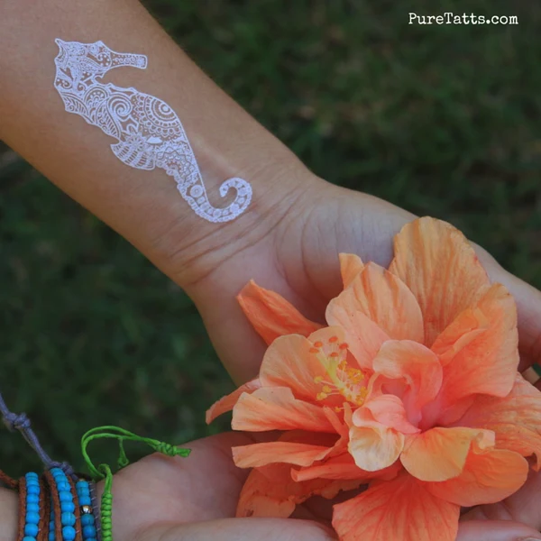
One distinctive white design can add another dimension to a monochrome arrangement. A white artist collaboration may sit between matte black and glossy black tattoos, creating a subtle contrast that appears differently against various skin tones and lighting conditions.
The strongest combinations reflect your style rather than following a fixed formula. If you prefer minimal styling, choose one matte anchor and two glossy accents. If you enjoy a more expressive arrangement, build a constellation of small designs across the shoulder, arm, or collarbone while keeping the artwork within a shared theme.
A thoughtful mix of velvety matte ink and light-catching gloss can turn temporary body art into a complete styling detail. Explore Pure Tatts designs, choose a central piece that reflects your mood, and add contrasting accents that move naturally with you. Select your combination, test the placement, and create a polished look that is ready for the next occasion.
Posted on

Posted on

Posted on

Posted on

Posted on

Posted on
Posted on