Temporary Tattoo Collection Donates 50% to Animal Rescue!
Posted on


Posted on
Posted on
Temporary tattoos make it easy to experiment with body art while keeping your style flexible. A layered arrangement can look intentional, editorial, and personal when each design has a clear relationship with the others. The goal is less about covering every available space and more about creating rhythm across the skin.
Black-and-white temporary tattoos are especially versatile because they work with casual clothing, evening looks, minimalist jewelry, and seasonal styling. Fine-line geometry, matte black symbols, white accents, and hand-drawn illustrations can all coexist when you consider placement, scale, contrast, and spacing.
A curated look begins before the tattoos touch your skin. Choose a visual direction, test the arrangement, and treat every design as part of one composition rather than a separate decoration.
Begin with a mood instead of selecting random designs. You might want a graphic arrangement built around geometric forms, a delicate collection of botanical details, or a high-contrast layout featuring matte black and white tattoos. Defining the mood helps narrow your choices and makes the finished look feel cohesive.
Color is another useful starting point. A monochrome collection can combine black ink with white details for contrast, while an all-black arrangement creates a sharper, more dramatic effect. If you are drawn to several styles, choose one dominant finish and use the others as accents.
Think about the message your arrangement should convey. Minimal symbols may suit a clean, understated look, while celestial motifs, abstract lines, and larger illustrations can create a more expressive composition. For context on how temporary designs compare with permanent ink, this temporary ink guide offers useful perspective before you commit to a style.
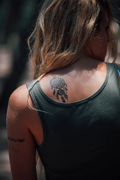
Placement determines how layered tattoos are read from a distance. Start with one anchor design in a visible area such as the forearm, shoulder, upper back, or calf. This central piece should have enough presence to establish the direction of the arrangement without overwhelming the skin around it.
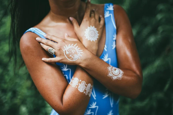
Add medium-sized designs near the anchor, following the natural lines of the body. A series that moves along the wrist and forearm can feel fluid, while shapes placed from the shoulder toward the collarbone can create a broader, gallery-like composition. Use the body’s contours as part of the design rather than treating the skin as a flat canvas.
Leave breathing room between the tattoos. Negative space prevents the arrangement from becoming visually crowded and gives each piece a chance to remain recognizable. A small symbol can act as a bridge between larger elements, but too many tiny designs may make the overall layout appear scattered.
A successful layered look usually includes three visual levels: one focal tattoo, a few supporting designs, and small accents. The focal piece attracts attention first, the supporting tattoos create movement, and the accents fill gaps or guide the eye through the arrangement.
Shape also matters. Pairing a circular design with angular geometry creates contrast, while repeating similar lines produces a more controlled, minimalist effect. Try placing curved artwork beside straight-edged symbols or combining a detailed illustration with a simple mark.
| Styling Element | Best Use | Visual Effect |
|---|---|---|
| Large focal design | Center of the arrangement | Establishes the main theme |
| Medium supporting tattoos | Around or along the anchor | Adds rhythm and movement |
| Small accents | Open spaces and transitions | Connects separate designs |
| Matte black finish | Bold focal points | Creates depth and definition |
| White ink style | Highlights and contrast | Adds a lighter, graphic touch |
| Geometric details | Structured arrangements | Gives the layout a modern feel |
When selecting designs, consider how they will look together at different distances. Intricate artwork can be striking up close, while clean silhouettes and strong lines help the composition remain readable across a room.
Your skin tone, clothing, and accessories all influence how temporary tattoos appear. White designs tend to create a subtle, high-fashion effect on some skin tones and a brighter graphic contrast on others. Matte black tattoos generally provide stronger definition, especially when placed where fabric will not constantly rub against them.
Plan the arrangement around the outfit you intend to wear. A shoulder and collarbone layout can complement a sleeveless top, while forearm designs may stand out against short sleeves or a rolled shirt cuff. For a more discreet option, place layered tattoos along the ribs, upper thigh, or back of the shoulder.
Jewelry can reinforce the composition. Fine bracelets pair well with small wrist tattoos, while rings and angular earrings can echo geometric artwork. Avoid placing too many competing details in one area; the tattoo arrangement should enhance the outfit rather than compete with every accessory.
Skin preparation helps each temporary tattoo adhere cleanly. Wash the area with mild soap, dry it thoroughly, and avoid applying lotion or oil beforehand. Smooth skin gives the transfer a more even surface and helps prevent edges from lifting early.
Apply the largest design first, then position the supporting pieces around it. This makes it easier to preserve spacing and avoid accidentally placing a small tattoo where a larger one needs to go. Follow the product instructions carefully, press the transfer firmly, and allow it to set before covering the area with tight clothing.
Once applied, limit excessive rubbing from bags, watches, rough fabrics, and frequent scrubbing. Pat the skin dry after washing and avoid applying body oil directly over the tattoos. If one edge begins to fade before the others, remove the piece and replace it rather than trying to patch the design.
Layering works best when the collection has a repeated visual detail. This might be a shared line weight, a similar botanical theme, a consistent geometric language, or a deliberate contrast between black and white. Repetition gives the eye a pattern to follow and makes different artists’ designs feel connected.
Seasonal styling can also guide the arrangement. In warmer months, build a visible composition across the arms, shoulders, and legs. For cooler weather, concentrate designs near the neck, hands, wrists, or ankles so they can peek through knitwear and layered clothing.
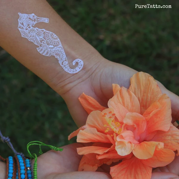
If you are selecting artist-created designs, look for details that reward closer viewing. Pure Tatts brings together artist-designed collection pieces that can work as individual accents or as part of a carefully coordinated layout. Mixing detailed hand-drawn artwork with simple symbols can give the arrangement a collected, personal quality.
Before applying the full set, arrange the tattoos on a clean sheet of paper or use small removable stickers to test placement. Photograph the mock-up from different angles and check how the pieces look when your arm, leg, or shoulder is relaxed. This quick preview often reveals crowded areas or gaps that are difficult to notice in a mirror.
Use these recommendations to keep the final composition polished:
A curated temporary tattoo layout should feel considered without looking overly arranged. Slight asymmetry can make the result more natural, especially when a larger focal piece is balanced by two or three smaller marks on the opposite side.
Explore Pure Tatts’ black-and-white designs to build a temporary arrangement that reflects your personal style, whether you prefer precise geometry, delicate white details, or bold matte black artwork. Start with one anchor piece, add thoughtful accents, and let the finished composition evolve with your look.
Posted on
Posted on
Posted on

Posted on

Posted on

Posted on
Posted on